Web designers are embracing more experimental approaches to their designs than ever before. With the multitude of creative solutions being produced, it can be difficult to know which will be a success and which will quickly fade away. The important thing is to understand how and why trends emerge and are adopted because it provides information about the current cultural vibe. It tells us what people are loving, what they are disliking, and what they want to move towards. Let’s take a look at some design approaches that are gaining traction.
GEOMETRICAL DESIGN ELEMENTS
Utilizing Boxes as Design Elements
Boxes can serve a number of purposes in regards to the aesthetics of a site. They can be used to make a simple design look more intricate and to highlight or link to specific content. Boxes can be presented as part of the background of page design or they can be used as pop-up pictures or calls to action. Boxed design elements will become more diverse as designers look to utilize a basic component in new and engaging ways.
Broken Grid Layouts
In design terms, the grid is an imaginary plane comprised of horizontal and vertical lines that are used to lay elements out on a page. On a traditional website, the grid is easy to envision. The various content pieces like the logo, title, and text, line up down the left side of the page. A broken grid layout pushes items around on the plane in a manner that makes the grid seem broken or less rigid. Breaking up the grid experiments with asymmetry, presenting the unexpected and pushing the boundaries of traditional design. While it is not a new concept, broken grid design is gaining in popularity as designers look to make bolder statements with their designs.
Campl.us breaks the grid with a diagonal image and a callout box that doesn’t exactly fit into the established columns. They also utilize a zig-zag path from top to bottom which, which nontraditional, is still easy for the viewer to follow:
Asymmetrical Layouts
Well-balanced asymmetry can hook viewers in their first glance. Unexpected, asymmetrical shapes are challenging but can provide the overall picture with a sense of direction. When used as vertical elements, they create flow, encourage further scrolling, and translate well to screen viewing on a mobile device. We’ll continue to see more use of asymmetrical layouts as designers move away from the rigid grid form that has dominated web design in recent years.
Overlapping design elements
Layering has long been a design tactic used to make a layout more interesting as it gives a more interactive vibe to the design. Similar to asymmetrical and broken grid layouts, overlapping items can spark visual interest to specific portions of content on a web page and enhance the overall aesthetic of a site. This approach is also helping web designers as they experiment with adding three-dimensional feeling to the page.
Layered elements are a touch unexpected as consumers have become accustomed to a more generous use of white space to create crisp, clear web pages. For this reason, poorly executed overlapping of elements can create a confusing presentation, especially for mobile users.
FLUID ELEMENTS AND DESIGN
Designers are slowly moving away from the straight lines inherent in flat design. They are, instead, experimenting with more fluid lines and shapes. These so-called, organic shapes are elements drawn from nature – a pond versus a perfect circle, a torn piece of paper versus a rigid triangle – bringing a new element of intrigue to website designs. The thought is that these shapes are more in line with human nature and make the overall design feel more approachable.
For an example that can’t be described, visit the website for Cam!
COLOR CHOICES
Monochromatic
Through the last decade, we’ve seen more and more color options added to the color palettes available for web design. With the over saturation of hues, a growing trend is to limit the design to a single color. While this adds constraints to the flexibility of design, it can create a more memorable impression when seen among other sites utilizing two, three, or more colors to present their content.
Absence of Color
In art and design, black, white, and gray are referred to as neutrals versus colors. Some designers are taking their approach to colors by leaving it out completely and embracing a minimalist approach by using all neutral palettes. This simplification of the color palette brings an air of sophistication to the design and creates sleek, modern web pages.
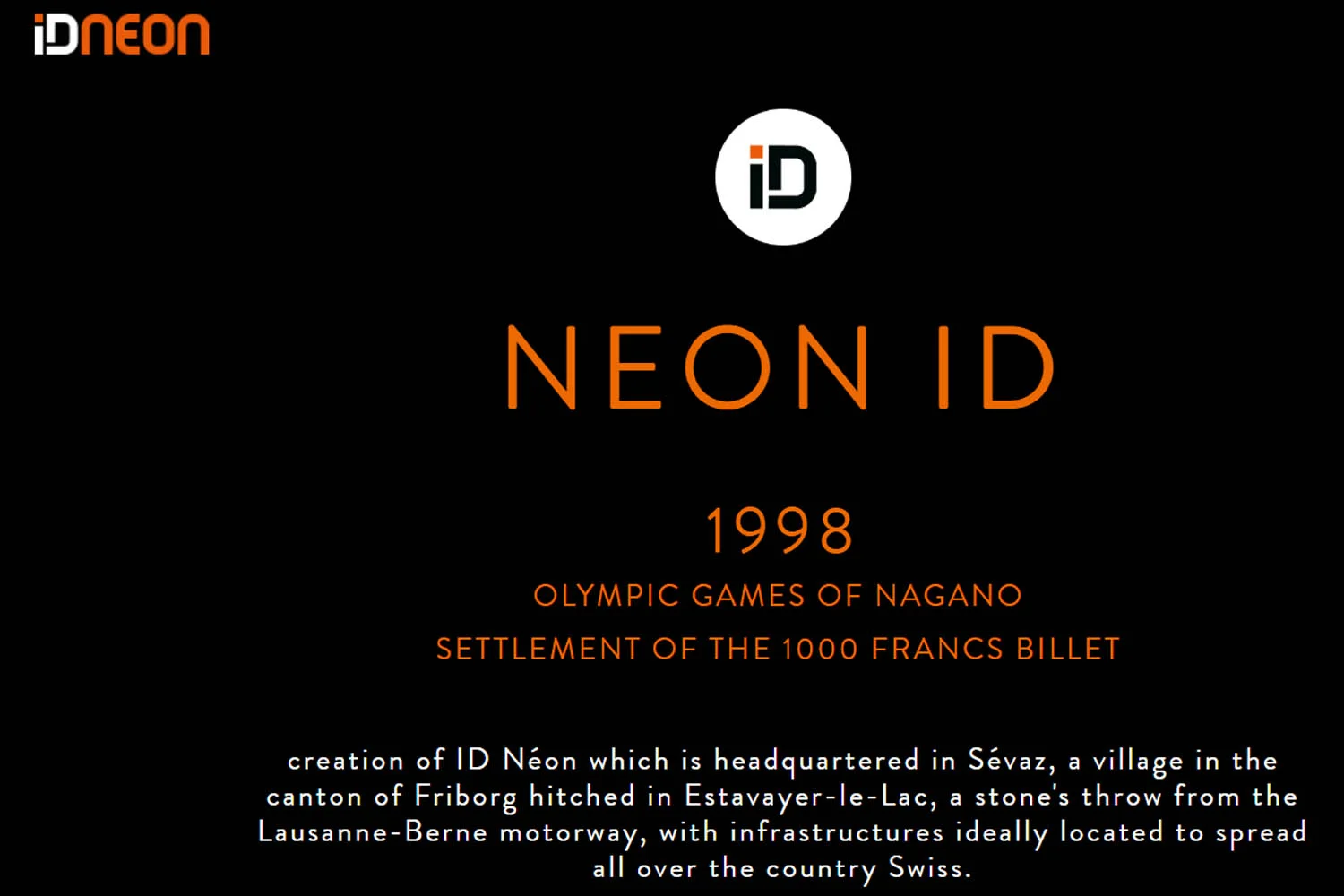
ID Neon uses a combination of these approaches by featuring the majority of their content in black and white with a splash of flat orange for some contrast:
NAVIGATION CHOICES
Large and Experimental
Forget changing font sizes, page placement, or basic layout options. Homepages consisting of nothing but navigation, sophisticated animations, and more are some of the navigational trends that designers are experimenting with. As designers continue to use mobile-first approaches, we’ll see more intriguing and creative navigation choices translate to desktop layouts in new and engaging ways. Pushing of boundaries of what is possible for navigation choices will continue as the general consumer becomes more and more comfortable trying new things on their web interfaces.
Hidden Navigation and Pop-Out menus
The combination of hidden navigation and pop-out menus was originally designed to make consumers more comfortable as they use mobile apps but has since been integrated into general web design. What the combination does is create more space on the screen which is helpful for not only promotional purposes but also in highlighting specific navigational elements of a site. This strategy for creating clean, clutter-free websites will continue to trend as consumers continue to embrace minimalist web features.
TYPOGRAPHY USED IN NEW AND DIFFERENT WAYS
Experimenting with typography is nothing new in the design world, but it has typically been easier to do in print than on the web. With more sophisticated coding and design options, web typography has become an arena that designers can influence more with their creativity.
Recent trends include the use of negative space to fill in purposefully eliminated sections of letters and words. We are seeing more presentation of text on a diagonal line or within a shape, animated typography, and asymmetrical text on sites. Designers are also making more use of text-based links verses offering overly cumbersome menu options.
LA Wine Agency utilizes a number of different typography elements by pairing various fonts and presenting part of the text diagonally:
VIDEO ELEMENTS
Videos are an excellent way to create engaging and interactive content on a website. Many more designers are incorporating video into the design of websites in a number of different forms. Some are full-screen header videos, others are embedded from social media, and still, others presented as pop-up content. We are also seeing an increase in video being used as part of a call to action. The art of mixing and matching animation with different video techniques will continue to provide designers with ample creative material to encourage site visitors to explore more of the website content.
WHITE SPACE
The effective use of white space to create a reader-friendly layout is not a new concept. The newer trend is to use white space as a focal point or to make a statement all on its own. This contrasting use of white space as an independent design element will continue to add to the aesthetics of web pages as designers get more creative with their use of nothingness.
SUMMARY
Geometrical Design Elements
Utilizing boxes
Broken grid and asymmetrical layouts
Overlapping and layering
Fluid Elements and Designs
Color Choices
Monochromatic
Absence of color
Navigation Choices
Large, hidden, and other experimental options
Pop-out menus
Typography
Video
White Space
The experts at Strategy Driven Marketing have extensive experience in the development and creation of engaging websites for organizations of all sizes and across a number of industries. We understand the important role a website plays for any brand and would love to learn more about your business so we can help you offer an effective and engaging website that will let you maximize your revenue potential. Contact us today – let’s get started!
Cover photo by rawpixel.com from Pexels


