

The navigation features on your website have a powerful impact on the user experience of your site visitors making navigational design one of the most critical parts of your website. You can beautifully showcase products and services while communicating a compelling brand story but, in the end, dysfunctional and difficult site navigation will send consumers clicking away at alarming rates.
Even the non-technologically savvy consumer expects clear, intuitive navigation when cruising through websites. But what does that mean? Should you offer scrolling or clicking? And exactly what is the consensus on that hamburger menu? We’ll take a look at navigation practices that work within existing design parameters so you aren’t asking visitors to unnecessarily learn something new and practices that fit audience needs rather than random aesthetic whims.
WHY IT MATTERS
Navigation affects the flow of traffic to your site. It impacts how high your website ranks with search engines and how much traffic they send your way. The algorithms used by search engines like Google and Yahoo consider engagement signals from user behavior. Bounces and other poor interaction signals will hurt your site’s ranking.
Navigation also affects conversions. Many studies have found that the easier a site is to you, the greater the percentage of conversion from visitor to customer. Strong navigation can help your visitors move smoothly through their buyer’s journey and encourage conversion decisions in your favor.
NAVIGATION OPTIONS
Menus and sub-menus are what we usually think of first when we talk about website navigation. They are structural in nature and guide visitors through the hierarchy within your website. Typical menus have been top, side, or drop-down. Newer carousel and side-scrolling content menus have become more common and offer users a slightly more interactive experience. With the popularity of mobile devices, we are seeing more thumb zone menus being used. The type of menus your website features should be governed by a combination of your audience and their needs with your organizational goals.
We may not consciously think of them as a form of navigation, but images, buttons, and icons can also be used to move visitors through pages of a website. These types of navigation are especially mobile device friendly as they are easy to click on a small screen. They can also be displayed in a more attention-grabbing manner than linked text. The key is to make sure the image, button, or icon is meant to be clicked to move the viewer elsewhere on your site.
Linked text is the lazy man’s button. There is a common understanding that blue, underlined text will take you from the current page to other, hopefully, relevant material. This type of navigation is often used to source content to an external link, in tables of content, and for other types of links within a site.
Website builders, like Squarespace, are offering site templates that feature a single, long scrolling web page. Instead of clicking on choices shown on a short landing page, the visitor scrolls, and scrolls, and scrolls to find the information he or she is looking for. In a world that is increasingly reliant on mobile devices, content that is thumb scannable is often preferred over content that requires adjusting one’s hold on the device to click an indicated link.
DIFFERENT THOUGHTS FOR MOBILE AND DESKTOP?
Reducing the number of navigation options will improve the experience on both mobile devices and desktop computers. That being said, there are features that work better each. While we hope most newer websites are being constructed via resources like Squarespace that automatically create device responsive websites, we’ll address some of the differences in case your brand maintains multiple versions of your website or caters exclusively to one audience or the other.
For Desktops
Breadcrumb navigation helps visitors move easily to previously viewed content without having to click the back button and run the risk of clicking themselves completely out of a site. Hover previews are a fabulous option to show linked text within articles or product features and details. Leave the hamburger and other collapsed menu alternatives for mobile devices. Space is rarely an issue on desktops and puts all of the visitor’s choices out in the open for them to consider at one time. Whichever you use, make sure the navigation option is logical and consistent throughout your site and that it helps your visitors find their way or decide what to do next.
For Mobile Devices
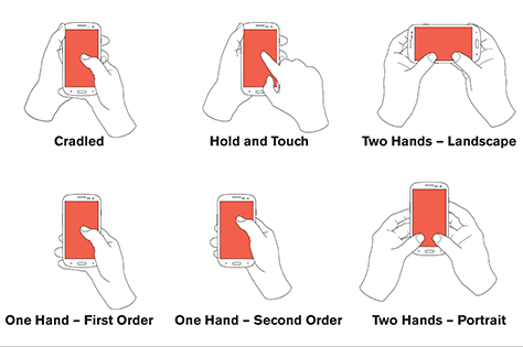
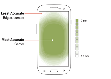
Designing websites for viewing on mobile devices will continue to be a challenge as manufacturers continue to produce differently sized screens. A strong rule of thumb is to remember the thumb. The thumb zone, that is.
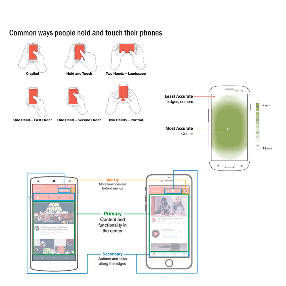
In a three-part series, Design for Fingers, Touch and People, Steven Hoober shares these figures from his research.
Consumers prefer to maintain a consistent grip on their device and sites that require shifting of the hand are less user-friendly than those that are navigable with just the thumb. Offering as few taps to get where you are going is another consideration (sorry hamburger). Consumers would rather scroll to see more options than tap, tap, tap.
https://www.uxmatters.com/mt/archives/2017/03/images/Hoober-Touch-Fig7.png
https://www.uxmatters.com/mt/archives/2017/03/images/Hoober-Touch-Fig8.png
https://www.uxmatters.com/mt/archives/2017/07/images/Hoober-Touch-Fig3.png
OTHER SUGGESTIONS
Be Descriptive
Your navigation is a place to tell visitors and search engines about what your brand does. Avoid generic terms like “services” or “products.” Use topics and keywords that will clearly describe what is being offered and that people will use in their searches. I, personally, have never typed “services” into a search engine but I have used terms like “hair coloring” or “hot stone massage” in my searches. While it may seem inconvenient at first to create a separate page for each service you offer, pages that are focused on a singular topic or keyword will rank higher with search engines than a single page that lists all of your services. If you absolutely have to make a “Services” page, be sure to link it to each of the individual pages that go into detail about each service (or product, or team member, etc.).
Skip the Drop-down Menus
Search engines, depending on how they are programmed, may have difficulties crawling drop-down menus. It has also been found that drop-down menus can be annoying for users. Many people have difficulties making decisions when given too many choices. If a visitor clicks something because he wants what he thinks that click will deliver and is, instead, presented with more choices, he may just click away.
Limit the Number of Items
Most research shows that seven or fewer (we like five) choices of menu items on a single menu are best. And, again, this is true in regards to both visitors and search engines. For visitors, it goes back to the whole overwhelming choice concept. Too many menu items make it difficult for people to remember and process the information and make it more likely they may gloss over important information.
In regards to search engines, each menu option counts as a link on each page of your website. Because spam sites tend to fill their homepages with links, Google and other search engines penalize sites with large numbers of links on the homepage. More concise navigation allows your homepage to gain higher authority with the search engines and for the authority of your homepage to flow down to the interior pages of your site. This will give them a better chance of ranking with search engines, too.
Order Matters
Attention and retention are highest when people are viewing the beginning and end of a list (serial position effect). While it may be difficult to prioritize, be sure to place the topics or items most important for your brand at the top or bottom of menus.
Don’t fool yourself into thinking that getting people to your website is the only goal. Provide clear, intuitive navigation to keep people on your site and encourage them to convert. The experts at Strategy Driven Marketing are experienced in website design, SEO best practices, and much more. To make sure you are offering a top-notch website with the most modern and convenient navigation possible, contact us today!